Introducing Marathon+
Today we're excited to introduce Marathon+: a new way to support Marathon and get exclusive features!
Some backstory: Marathon started off as a passion project over two years ago and has since grown into something bigger than I could have ever imagined. As Marathon continues to grow, we have remained a founder-led, bootsrapped project, only ever asking for donations to offset server costs.
We want the core of Marathon to remain free for everyone. We are not interested in serving ads or selling customer data, and we are not beholden to listen to VCs. Our one and only mission is to make Marathon the best user experience for all of you.
Marathon+ is a new way to show your support for our mission. For the low price of 1.99 USD per month, you will receive an exclusive member badge next to your name, the ability to customize your show posters, and a great number of features still to be released.
Your support means the world to us and allows us to keep Marathon ad-free and user-first. Thank you for being part of our journey and for helping us make Marathon the best it can be for everyone. 💚
New & improved
Fixes
Watch progress
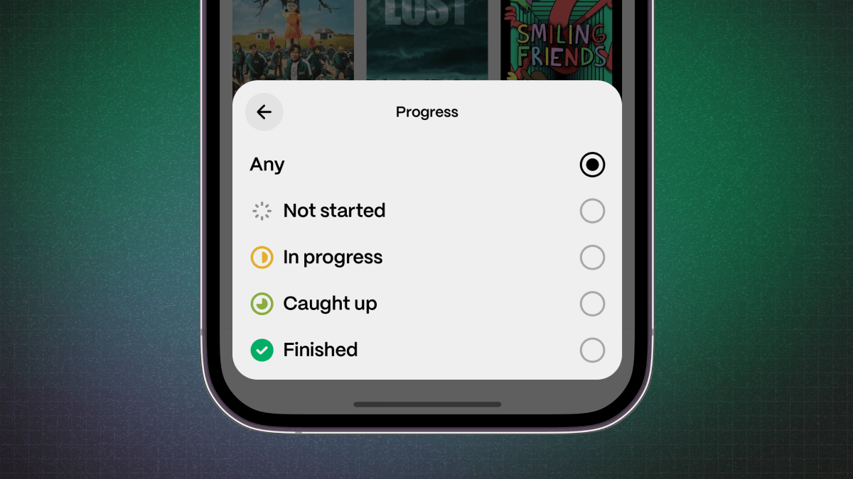
As part of our new filtering system, we wanted to tackle our most popular feature request with watch progress filters.
You can now filter your watchlist and shows by how much progress you've made:
-
Not startedis for shows you've added but haven't watched any episodes of -
In progressis for shows you've started and are in the middle of watching -
Caught upis for shows you've watched all available episodes of -
Finishedis for shows you're caught up on and that have ended
-
Filter, sort, and save
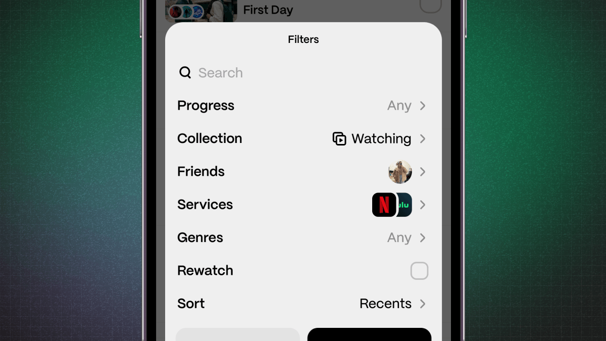
Our old filtering system was confusing for many members, so today we're introducing a brand new system!
On any filterable page, tap the new
Filterbutton in the top right to bring up all possible filter settings.There's also a new handy
Sortbutton right next to it to quickly change the order of results.Some pages, like your watchlist, will save your filters for the next time you open the app! No more re-entering the same few filters every time.
Search from anywhere
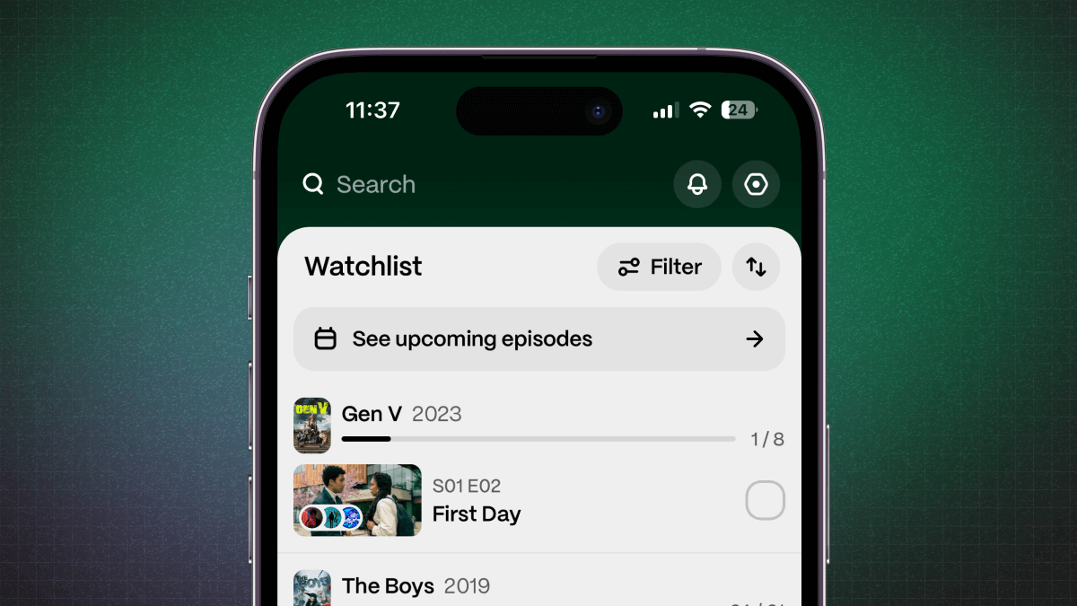
We've made it easier than ever to start a search in Marathon. Simply tap the
Searchbutton from anywhere and start typing.We redesigned search to be an immersive experience, and when you're done you're popped right back to where you started.
The new results screen will show our most popular item at the top — you can quickly navigate to it with your
returnkey!Otherwise, you can dive into a specific category (either shows, members, or lists) and page through all the results.
New & improved
Fixes
Data import is now in beta!
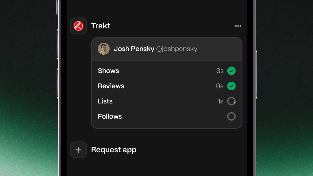
One of our most requested features is now live: imports!
Starting today, you can now perform a one-time import of your data from an existing Trakt account. We won't just pull shows, but also any reviews, lists, and users you follow.
During this beta phase, we're only allowing one import per user, though this may change over time.
We're excited to get this into your hands and see how you like it! If you have another app you'd like to see, let us know with a feature request.
New & improved
Fixes
Long press, everywhere!
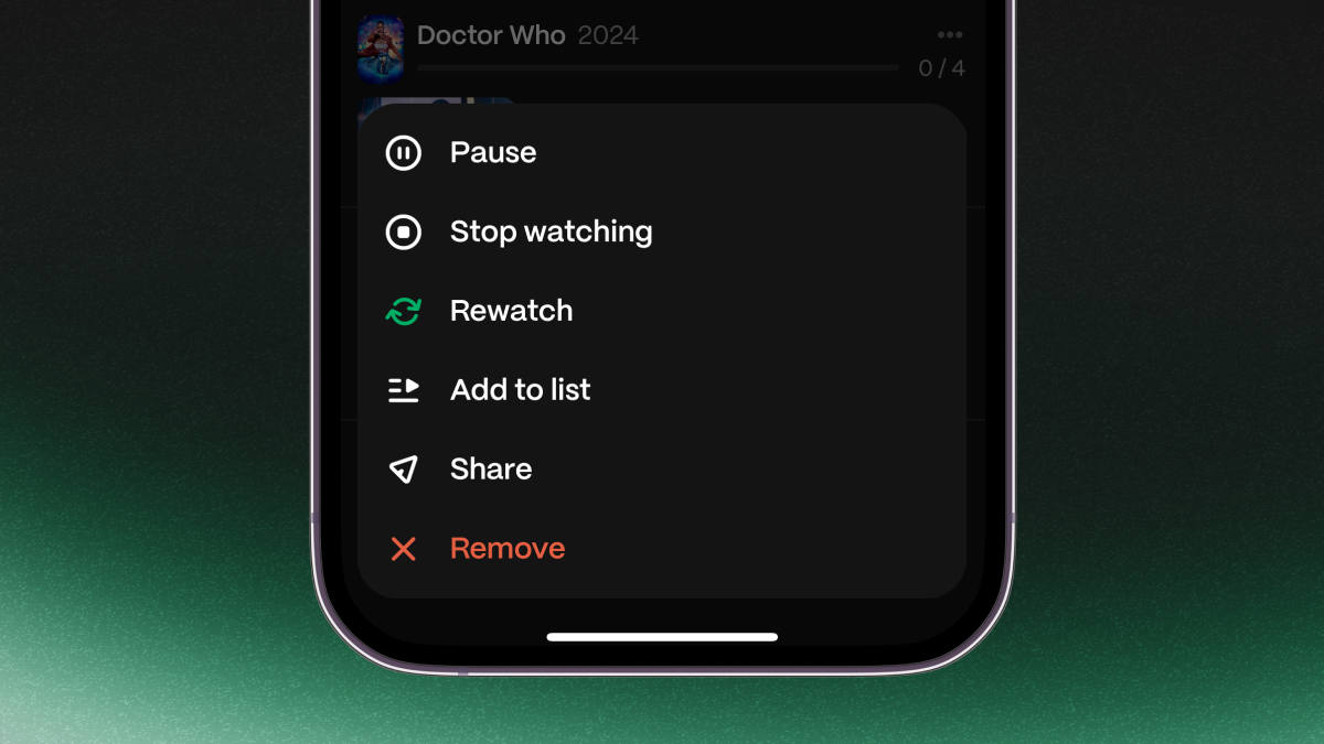
Quick actions allow you to, well, quickly take action on any item.
We're now bringing this functionality across the entire app! Simply long press on a series, episode — you name it! — and you'll be presented with a rich menu with quick actions.
New & improved
Fixes
Show navigation
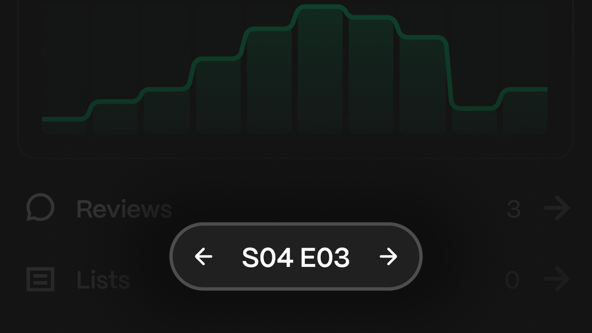
We're making it easier to dive into shows.
Seasons now have their own pages in the app! It'll now be easier to tell when you're on a season page or a show.
We also added a floating toolbar to the bottom every episode and season page, allowing you to quickly jump to the previous or next one.
And we couldn't forget about the gestures. Simply swipe left or right on an episode and season page to navigate to the previous or next one.
New & improved
Fixes
Website refresh
When people asked us what Marathon was, we realized we didn't have a place to direct people for answers.
Today, we're re-introducing the Marathon homepage with a fresh coat of paint! From our new site, you can now:
- quickly access download links
- read up on frequently asked questions
- or check out the latest changes to the app.
And of course, the web app is always available at /feed.
Fixes
Feature requests
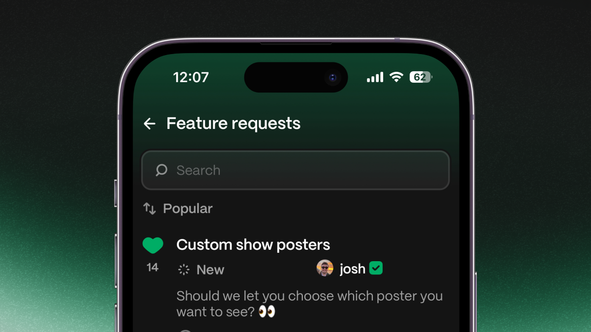
Have a feature idea for Marathon? You can now post, like, and comment on feature requests in our apps!
If you post or comment on a feature request, you'll also get realtime updates as we work on it.
We'll be picking your favorites to add to the app! 💚
New & improved
Fixes
Revamped notifications
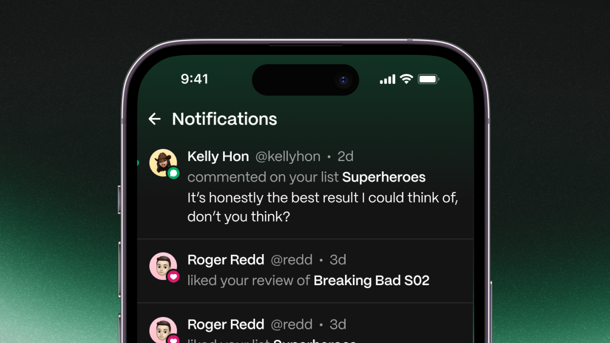
Starting today, we released a new design for your notifications screen.
-
Each notification now has a colored icon to signal what type it is.
-
Read notifications no longer are dimmed. Rather, unread notifications have a green dot next to them.
-
You no longer need to manually mark notifications as read — they will do so automatically.
New & improved
Fixes
-