Explore screen
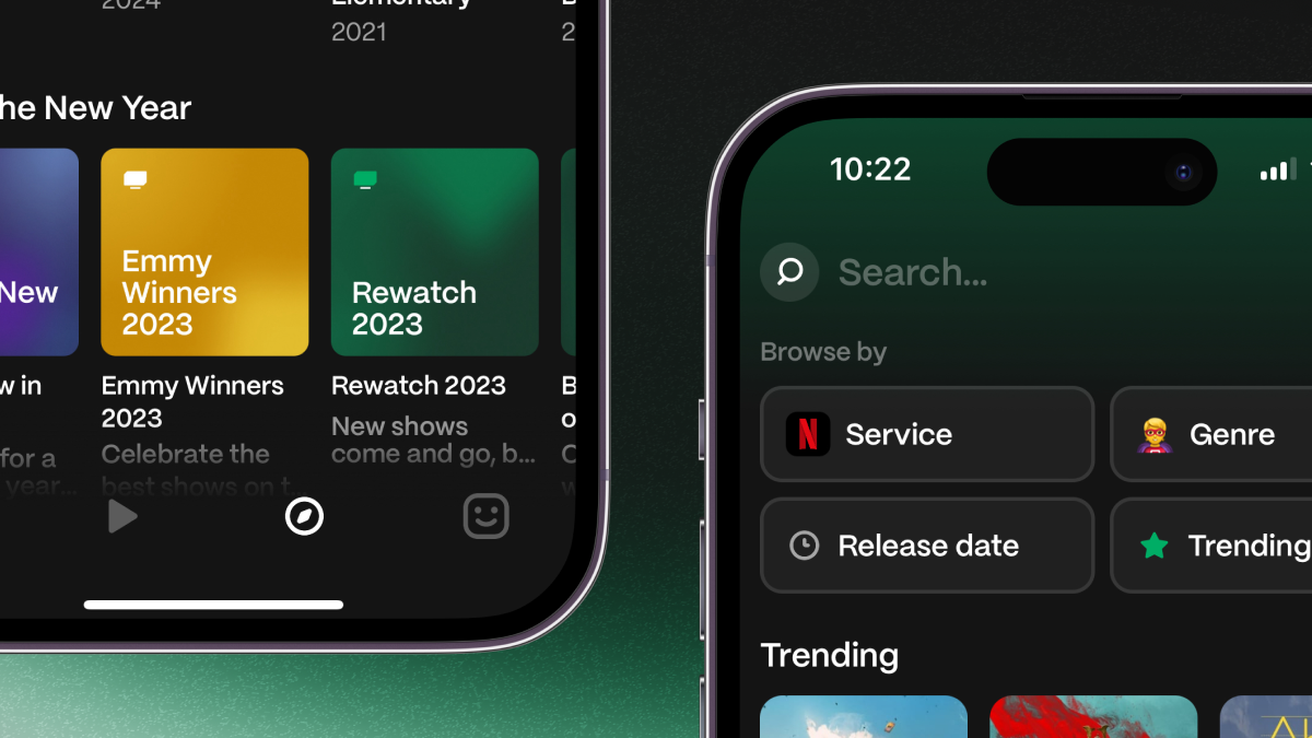
Discovery is an important aspect of Marathon and we just made it easier!
The new Explore screen enables new ways of finding and browsing shows:
-
You can now browse shows by streaming services (and favorite ones you subscribe to).
-
You can also browse shows by genre or release date.
-
Below trending shows is a new section of featured content — check back every month for new lists!
New & improved
-
Original languages
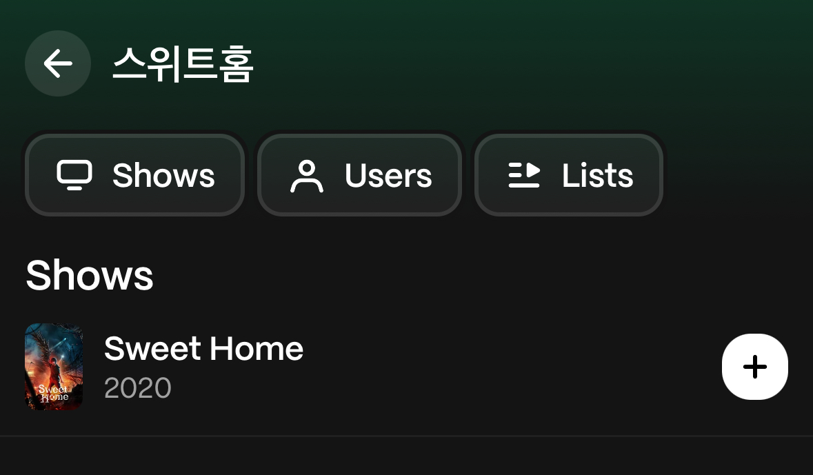
You can now search for shows using their original language name!
The original name for the show is also available on the show page.
Change location
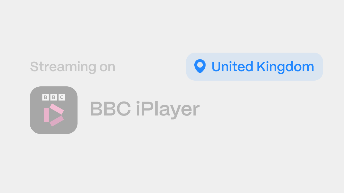
Find where you can stream shows locally in your home country 🌍
You can now choose which country you're from in Marathon and we'll filter our data to present only streaming services available to you.
New & improved
Rewatch
We've been working hard on bringing this feature to you and are excited to announce today: rewatches are now officially supported!
Ever wanted to log your progress for a show you've already seen? Well, now you can!
To get started, tap the
Rewatchbutton on a show page and create a new rewatch.From there, you can start logging your progress, add a note (like who you're watching it with), or start another rewatch.
New & improved
Fixes
One Year 💚
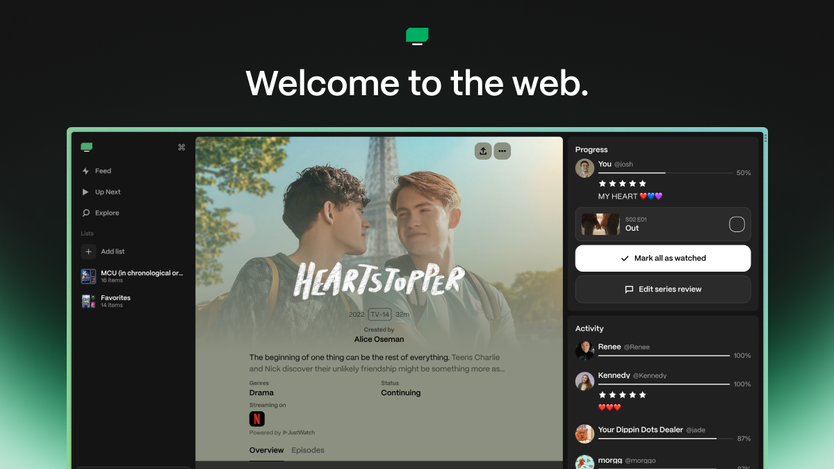
One year ago today, we launched Marathon to the world on iOS! In the year since, we've expanded to Android and seen over 7,000 new users join us for their television watching journey. Today, we're excited to deliver on folks' biggest request: Marathon for web. 💚
You can now access Marathon on your biggest screen and have it sync to your phone. No matter where you're watching TV or who you're discussing with, you'll always have Marathon available.
I wanted to take this time to thank everyone who has joined us along for this journey. One year is a long time, and we couldn't do it without your support. We read every piece of feedback you send in and are excited to deliver on the things you want. Expanding to web is just the first step — we've got big plans in store!
We are a small team of one (hello! 👋) building Marathon in the after hours. If you'd like to support us, please donate to our Tip Jar or contact me at [email protected] for a larger investment.
Until the next time, keep calm and Marathon on!
Polishing Week
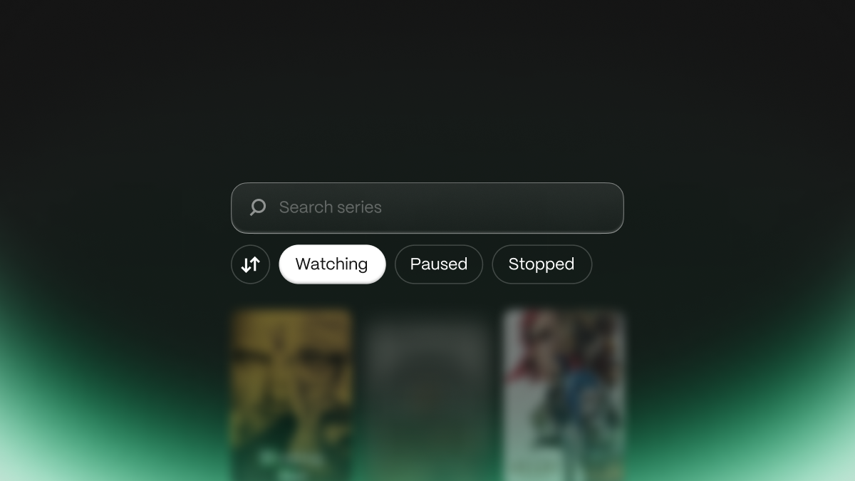
Every so often, we like to spend some time polishing up the app. With so many features added so frequently, there's always the chance of "papercuts" making their way in. The goal of this update is to fix some of these little issues to make an overall better experience for you.
Simpler Series
Search, Sort, and Filter
Unranked Lists
Polish, Polish, Polish
Feedback Week 2
After a successful first Feedback Week, we're back with round 2! This time around, we posted a Twitter poll asking what you wanted to see the most.
Usernames
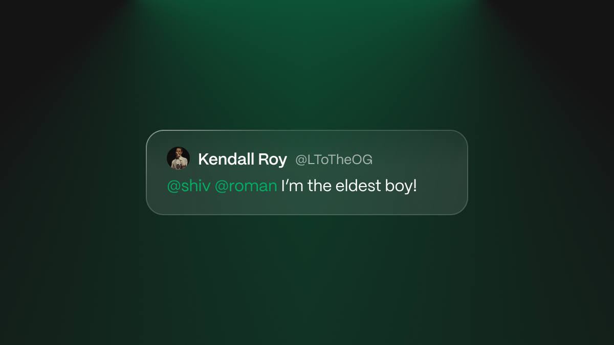
@mentions
New Episode Notifications
Mark Previous as Watched
...And More!
A Small One
Welcome back to The Marathon Show! I'm your host Josh and today we've got a small but mighty update for you. So sit back, relax, and enjoy the show!
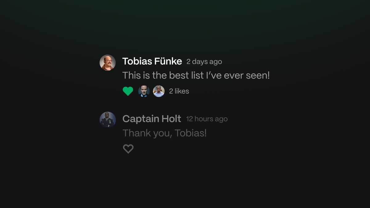
Like comments
Improved notifications
Better comments
Coming soon...
Feedback Week 1
Marathon prides itself on providing transparency into our process and listening to user feedback (we have a form built right into our app!). This week, we decided to take a pause on the bigger features we're working on to focus solely on implementing user feedback. Consider it our first of many Feedback Weeks!
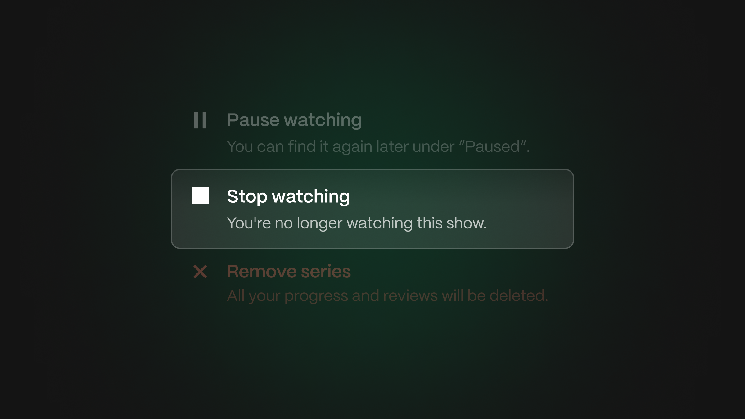
Stop Watching
Not Started
Remove Avatar
Signing Up Again
...And More!
We Formed a Company

Marathon TV, Inc. is a brand new startup founded by Josh Pensky. Our mission is to foster a community of television enthusiasts and help folks tell their story through this new Golden Age of Television.
Why Now?
What's Changing?
What Can I Do?