Revamped notifications

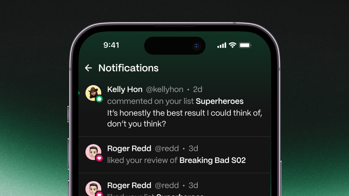
Starting today, we released a new design for your notifications screen.
-
Each notification now has a colored icon to signal what type it is.
-
Read notifications no longer are dimmed. Rather, unread notifications have a green dot next to them.
-
You no longer need to manually mark notifications as read — they will do so automatically.