What's New
See the latest from the social TV network.
A Brand Emerges
Less than a year ago, we introduced Marathon to the world with the image of a rainbow gradient lighting up a TV screen. Our logo served us well. We created 12 (!) app icons that played with our logo in some way or another. We designed countless social media posts, announcing new features and our 2023 roadmap. But most importantly, it represented who we were: a bright, queer-founded start-up with a love for television that we wanted to share with the world.
As Marathon continues to grow (as of writing, we're 3,000 strong!), we found that we reached the limit of our current branding. So, over the past few weeks, we tasked ourselves to find a new brand, one that could scale as we do. And, Marathon family, we've found it.
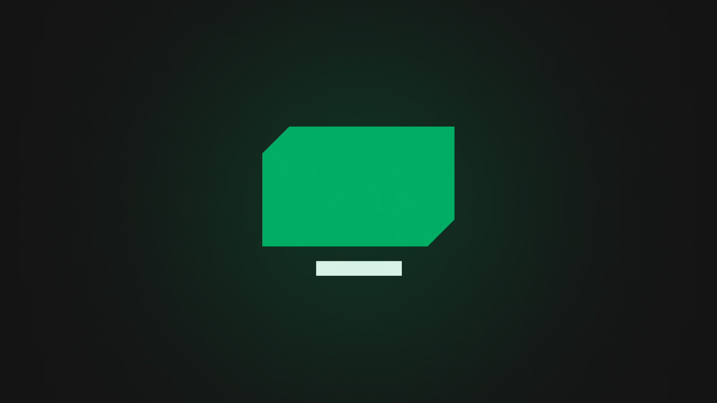
The new Marathon logo is simple: it's a TV! But this TV opens up the door for new possibilities we couldn't imagine before — and we've already got a few ideas ready to go.
So, what else has changed? Marathon's emerald green has shined bright throughout our app since day 1 and it was about time we put it front and center, replacing our old rainbow gradient 💚. We've also simplified our typography, now relying only on Pangram Pangram's Mori family, and cleaned up the icon system to match our new angular logo. And, of course, we couldn't forget our lovely app icons, which we refreshed across the board. Check out our brand kit for the full scoop.
A website is the perfect expression of a brand, and so we've updated ours to show off what our new logo can do. Check it out!
We're so excited by Marathon's future and hope you are too! You'll start to see our branding updates roll out in our Android and iOS apps over the next few weeks.